The Chart Types
Now that we understand that the Open (O), high (H), low (L), and closure (C) provide the finest summary of trading activity, we require a charting technique that displays this information well. The OHLC consists of four data points for each trading day. When examining a 10-day chart, we must view 40 data points (1 day x 4 data points per day). So you can image how difficult it would be to visualize data for six months or an entire year. Conventional charts, such as column charts, pie charts, and area charts, are not suitable for technical analysis. The standard charts are ineffective because they only present one data point at a given time. However, Technical Analysis demands the simultaneous display of four data points. And Japanese Candlestick shows all of them.
History of Japanese Candlestick
Before we start, we should take a few minutes to learn about the short history of the Japanese Candlesticks. Japan is where the candlesticks came from, as the name suggests. A Japanese rice merchant named Homma Munehisa was the first person to use a candlestick. This was in the 18th century. Even though candlesticks have been around for a long time in Japan and are probably the oldest way to look at prices, traders in the west had no idea what they were. It is thought that a trader named Steve Nison accidentally found candlesticks in the 1980s, and he was the one who introduced the method to the rest of the world. He authored the first ever book on candlesticks titled “Japanese Candlestick Charting Techniques” which is still a favorite amongst many traders.
Candlestick Anatomy
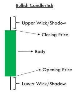
In a bar chart, the open and close prices are represented by a tick on the left and right sides of the bar, but in a candlestick, the open and close prices are represented by a rectangular body. In a candlestick chart, candles can be classed as bullish or bearish, with blue/green and red/black representing bullish and bearish candles, respectively. Obviously, the colors can be changed to any color of your choosing; the technical analysis program enables this. In this module, we have chosen the color combination of blue and red to symbolize bullish and bearish candles, respectively. Consider the bullish candlestick. Similar to a bar chart, the candlestick is composed of three components.
1.The Central real body – The real body, rectangular in shape connects the opening and closing price
2.Upper shadow – Connects the high point to the close
3.Lower Shadow – Connects the low point to the open Have a look at the image below to understand how a bullish candlestick is formed:

This is best understood with an example. Let us assume the prices as follows: Open = 62 High = 70 Low = 58 Close = 67 Likewise, the bearish candle also has 3 components:
1.The Central real body – The real body, rectangular in shape which connects the opening and closing price. However the opening is at the top end and the closing is at the bottom end of the rectangle
2.Upper shadow – Connects the high point to the open
3.Lower Shadow – Connects the Low point to the close
This is how a bearish candle would look like: This is best understood with an example. Let us assume the prices as follows. Open = 456 High = 470 Low = 420 Close = 435 Once you internalize the way candlesticks are plotted, reading the candlesticks to identify patterns becomes a lot easier.
This is how the candlestick chart looks like if you were to plot them on a time series. The blue candle indicates bullishness and red indicates bearishness.

Also note, a long-bodied candle depicts strong buying or selling activity. A short-bodied candle depicts less trading activity and hence less price movement.
To sum up, candlesticks are easier to interpret in comparison to the bar chart. Candlesticks help you to quickly visualize the relationship between the open and close as well as the high and low price points.